At the time you look at a generator efficiency curve, you’re seeing how effectively the unit turns fuel into usable electrical output at each load point. You can compare performance at 25%, 50%, 75%, and 100% load, then spot where efficiency peaks and where it falls off. That shape tells you more than a spec sheet ever will, because it can expose concealed losses, control issues, and operating limits before they become expensive.
What Is a Generator Efficiency Curve?
A generator efficiency curve shows how a generator’s electrical efficiency changes as its load changes.
You use it to see how well the unit converts fuel energy into electrical output at different operating points, not just at rated capacity.
This curve gives you a quantitative baseline for selection, sizing, and operating cost analysis, so you can make decisions with confidence.
Whenever you compare actual performance against the curve, you can spot drift promptly, support predictive maintenance, and verify responsive calibration after service or control updates.
Because efficiency varies across load levels, the curve helps you identify the operating range where your system performs best.
In case you’re part of a team managing power assets, this shared metric keeps everyone aligned on fuel use, reliability, and efficiency goals.
How the Efficiency Curve Works
As load changes, the efficiency curve traces how much electrical output you get for each unit of fuel input at that operating point. You’ll see the curve rise toward peak efficiency near rated load, then fall as you move into partial-load regions where fixed losses dominate.
By comparing points at 25%, 50%, 75%, and 100% output, you can quantify relative output, fuel consumption, and heat rate with consistent units. That lets you judge whether your generator’s transient throttling strategy keeps it in its efficient band.
If the curve shifts over time, you can flag wear, injectors, or control issues promptly. In that way, the curve supports predictive maintenance, giving your team a shared technical baseline for operating decisions and performance checks.
Why Generator Efficiency Curves Matter
You use the generator efficiency curve to match output to load, because efficiency changes sharply as load shifts.
Whenever you operate near the curve’s peak, you reduce fuel per kilowatt-hour and lower operating cost.
In case you ignore load matching, you’ll run the generator in inefficient regions and waste energy.
Efficiency And Load Matching
Generator efficiency curves matter because they show how closely a generator’s operating load matches its most efficient range. Once you align your demand forecasting with the curve, you can keep units near their peak conversion zone and support load optimization across your system.
You’ll see that efficiency usually drops at light loads, so matching capacity to demand isn’t just tidy engineering—it’s the basis for stable, precise operation.
- Track load bands where efficiency stays highest.
- Compare actual demand to rated capacity.
- Schedule generators to avoid chronic underloading.
- Use curve data to coordinate parallel units.
Operating Cost Impacts
As soon as efficiency falls off the peak of the curve, fuel use rises faster than power output, and that directly increases operating cost. You pay more per kilowatt-hour because each partial-load hour burns extra fuel without adding useful energy.
That penalty compounds in daily fuel budgeting, especially during your system cycles through light-load periods. You also see indirect costs: higher exhaust temperatures, more soot, and faster wear on injectors, filters, and lubricants.
Whenever you track the curve, you can align demand with better load points, cut waste, and improve maintenance scheduling. In practice, this lets you forecast expenses more accurately, compare generator sets objectively, and keep your team aligned around measurable efficiency targets.
Generator Efficiency Curve vs Load
Whenever you compare a generator efficiency curve against load, you’ll see that efficiency usually rises from partial-load operation toward a peak near rated capacity.
You can use that peak efficiency point to identify the most effective operating range for fuel use and power output.
Should you push beyond best-performing load, efficiency drops and losses increase, so overload operation reduces total performance.
Efficiency At Partial Load
That means your fuel use per kilowatt-hour rises, and partial emissions increase for the same delivered power.
- Monitor relative output to spot where efficiency starts declining.
- Compare 25%, 50%, and 75% load points for a clear curve.
- Track heat rate or specific fuel consumption, not just power.
- Keep transient stability in mind whenever you operate below rated load.
For your team, this shared view helps you match operating load to actual demand and avoid wasting energy.
Peak Efficiency Point
The efficiency curve usually reaches its best point near rated load, where the generator converts the largest share of input fuel energy into electrical output. You’ll usually see this peak while engine speed holds near optimal RPMs and combustion stays stable.
At this point, your system can deliver maximum useful power with the least specific fuel consumption, so every kilowatt-hour costs less to produce. Good thermal management supports that peak through keeping temperatures in the range the designer intended, which helps preserve electrical and mechanical losses at low levels.
Whenever you compare units, focus on the curve’s highest point, not just nameplate rating, because that’s where your team gets the strongest efficiency, the cleanest operating margin, and the most reliable baseline for load planning.
Efficiency Drop At Overload
Once you push a generator beyond its rated load, efficiency typically falls because losses rise faster than useful electrical output. You’ll see the curve bend downward as the alternator, engine, and controls work harder to sustain power.
- Overload protection might trip, preventing sustained damage.
- Thermal stress increases winding resistance and mechanical wear.
- The fuel pump can’t always maintain ideal combustion under heavy demand.
- Voltage regulation degrades, so output quality slips and efficiency suffers.
When you operate near overload, you’re not just losing fuel economy; you’re shortening service life and reducing system reliability.
In case you belong to a team managing critical power, keep load within the rated band, monitor temperature, and log efficiency shifts. That discipline helps you spot overload sooner and protect performance.
What Causes Generator Efficiency Losses
Generator efficiency losses come from the gap between fuel energy input and electrical energy output, and they grow as the machine operates away from its peak load range.
You’ll see them whenever mechanical wear increases friction, or whenever lubrication issues raise parasitic drag.
Thermal losses also climb as hot surfaces reject more energy, while cooling inefficiency lets internal temperatures drift upward and erode conversion efficiency.
Poor fuel quality can disturb combustion timing, leaving more unburned energy in the exhaust.
High exhaust backpressure forces the engine to work harder, and degraded electrical insulation adds resistive and dielectric losses in the alternator.
Together, these faults shift the curve downward, so you and your team get less electrical output from each unit of fuel.
Monitoring them helps your crew stay aligned on reliable, efficient operation.
How to Read a Generator Efficiency Curve
To read a generator efficiency curve, you initially match the x-axis to load percentage and the y-axis to electrical efficiency, so you can see how performance changes as output varies.
You’ll usually find peak efficiency near rated load, where the curve reaches its maximum value.
Then you can compare partial-load ranges to quantify how quickly efficiency drops as load decreases.
Understanding Curve Axes
Whenever you read a generator efficiency curve, the horizontal axis typically shows relative output or load percentage, from 0% to 100% of rated capacity, while the vertical axis shows electrical efficiency as a percentage of fuel energy converted into useful power.
Check the axis labels initially so you know exactly what each value represents. Then verify scale selection, because a linear or uneven scale can change how you interpret spacing and trend.
- X-axis: your operating load
- Y-axis: your conversion performance
- Units: confirm percentages, not raw power
- Direction: higher is usually better
You’ll read the curve correctly once you compare points at identical loads. That lets you join a shared technical baseline with other operators and make precise, defensible decisions.
Identifying Peak Efficiency
Peak efficiency usually appears near the top of the curve, where the generator converts the largest share of fuel energy into electrical output. You should identify that apex as the operating point with the lowest fuel consumption per kilowatt-hour and the highest conversion ratio.
On most curves, it sits close to rated capacity, but you still need to verify the manufacturer’s data for your unit. Compare nearby points to see whether the slope flattens, since that indicates a narrow sweet spot.
You can use this marker to guide maintenance scheduling, because rising losses often shift the peak over time. Also check ambient effects, since temperature and altitude can alter the apparent maximum.
Whenever you read the curve this way, you’ll fit your system into the most efficient group.
Reading Load Ranges
Once you’ve identified the peak, read the rest of the curve against comparing generator output at specific load ranges, typically 25%, 50%, 75%, and 100% of rated capacity. You’ll see efficiency usually falls off at low load, so check where fuel use starts to rise faster than power output.
- At 25%, observe how much energy you’re spending per kWh.
- At 50%, compare stability and transient response under typical cycling.
- At 75%, verify whether the curve approaches its efficient operating band.
- At 100%, confirm rated performance and heat-rate behavior.
Use these points to match your unit with real demand, not just nameplate data. Whenever you read the curve this way, you’ll belong to the operators who size, schedule, and monitor with precision.
The Best Load Range for Peak Efficiency
For most generators, the best load range for peak efficiency sits near rated capacity, typically around 75% to 100% load. You’ll usually see the curve flatten there, so your unit converts input energy most effectively and keeps losses proportionally lower. Should you plan operation inside this band, you’ll join the group that uses assets more intelligently and avoids unnecessary derating.
Use ideal turndown to define the lowest practical load before efficiency drops sharply, and align maintenance scheduling with periods when you can keep demand near that range.
Below 75%, efficiency usually falls fast, so you ought to treat sustained light loading as a design constraint, not a normal operating target. Size your generator to match expected demand, and you’ll protect performance.
How Fuel Use Changes Across the Curve
Fuel use doesn’t change linearly as generator load moves across the efficiency curve. You see fuel behavior shift with each load step, because fixed losses stay high at light load and useful output rises faster later. In consumption mapping, you track how liters or kilograms per kilowatt-hour fall as you approach the efficient band, then flatten near rated output. That pattern helps you predict operating cost and avoid misleading averages.
- Low load: fuel burns, but power output lags.
- Mid load: conversion improves, so consumption drops.
- Peak load: marginal gains shrink, but efficiency stays strong.
- Over time: your recorded curve exposes real operating behavior.
When you compare your data points, you gain a clear operational baseline and join a disciplined group that sizes and runs equipment with precision.
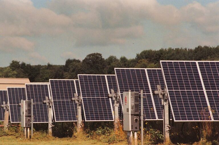
How Diesel, Gas, and Inverter Generators Compare
How do diesel, gas, and inverter generators stack up on efficiency? You’ll usually see diesel lead at steady, high loads, gas trail slightly, and inverter units excel at variable demand because they modulate output tightly. That matters whenever you compare fuel flexibility, emission profiles, startup behavior, and noise levels.
| Type | Efficiency profile |
|---|---|
| Diesel | Highest at sustained load |
| Gas | Balanced, but lower peak efficiency |
| Inverter | Strong at light, fluctuating loads |
You can read this as a practical hierarchy: diesel favors constant duty, gas offers broader fuel flexibility, and inverter systems give your group quieter operation with cleaner output quality. Should you be sizing for shared use, match the curve to your load pattern; that’s where you’ll protect efficiency and avoid wasted fuel.
The Biggest Factors in Generator Efficiency
Should you want to understand generator efficiency, start with load level, because it drives the curve more than any other variable. You’ll usually see peak efficiency near rated output, while light loading leaves more fuel energy unused. Ambient temperature also matters: hotter intake air reduces combustion density and can raise losses, so your curve shifts. Fuel quality and engine calibration shape how completely you convert energy, and poor maintenance scheduling lets filters, injectors, and cooling surfaces drift out of spec.
- Load matching keeps you in the efficient zone.
- Temperature changes alter combustion and cooling behavior.
- Fuel properties affect heat release and stability.
- Maintenance scheduling preserves designed performance.
When you track these factors together, you’ll spot why two identical generators can deliver different efficiency curves and how your team can interpret the data with confidence.
How to Improve Generator Efficiency
To improve generator efficiency, you need to keep operation as close as possible to the load range where the curve peaks, since output drops in efficiency quickly at partial load. You should right-size the unit, then match demand through staged dispatch or load sharing so you’re not idling inefficiently.
Schedule routine maintenance to preserve combustion quality, cooling, and electrical alignment, because small faults raise fuel use and reduce net output. Use calibrated monitoring to verify power factor, fuel rate, and relative output, then adjust settings from real data, not assumptions.
Operator training matters too: whenever your team understands the curve, they can hold stable loading, spot drift prematurely, and respond consistently. That discipline keeps your system aligned, efficient, and part of a high-performing crew.
Common Mistakes When Reading the Curve
A common mistake is treating the generator efficiency curve as a single fixed number instead of a load-dependent relationship, which can lead you to overestimate performance at light loads and underestimate fuel costs.
You also need to read the axes carefully; misinterpreting scales can make a small efficiency change look dramatic or insignificant.
Another error is ignoring ambient conditions, because temperature and altitude can shift the curve enough to affect your analysis.
- Check the load percentage, not just peak efficiency.
- Verify the units before comparing curves.
- Confirm whether data reflect steady-state testing.
- Compare like-for-like fuel and rating conditions.
When you and your team read the curve correctly, you get a clearer baseline, better estimates, and fewer planning errors.
Real-World Uses for Efficiency Curves
Once you read the generator efficiency curve correctly, you can use it to make concrete operating decisions instead of treating it as a theoretical chart.
You can match load to the region where fuel use per kilowatt-hour stays lowest, then size standby units so they don’t linger at wasteful partial load.
You’ll also use the curve to compare real output against vendor data, which helps you spot degradation prematurely.
In your team, this supports maintenance scheduling because rising fuel consumption at the same load often signals wear, fouling, or control drift.
You can pair the curve with emission monitoring to see how inefficient operation drives higher exhaust output.
That gives you a defensible basis for dispatch, cost control, and system reliability.
Frequently Asked Questions
How Is Generator Efficiency Calculated From Output and Fuel Input?
Calculate generator efficiency by dividing electrical output by fuel input, then multiplying by 100. Using fuel measurements and output data, you can compare delivered power with consumed energy and identify losses accurately.
What Does a 50% Load Efficiency Rating Mean?
At 50% load, the generator is operating below full capacity, so it turns fuel into electricity less efficiently than it does at higher output levels. Heat losses increase, which means more fuel is required for each kilowatt hour produced.
Why Do Efficiency Curves Change With Fuel Type?
Efficiency curves shift because each fuel has different combustion chemistry and heating value, which changes usable energy output, losses, burn rate, and peak efficiency across generator loads.
What Is Specific Fuel Consumption on a Generator Curve?
Specific fuel consumption measures the fuel required to produce each kilowatt hour of electricity, usually shown in g/kWh. Lower values indicate better generator efficiency, and the metric reflects how fuel use changes with load.
How Are Efficiency Curves Measured During Load Testing?
Measure efficiency curves by loading the generator at 25%, 50%, 75%, and 100%, then record fuel input, power output, and losses. Use thermodynamic modeling and sensor calibration to expose each efficiency change.